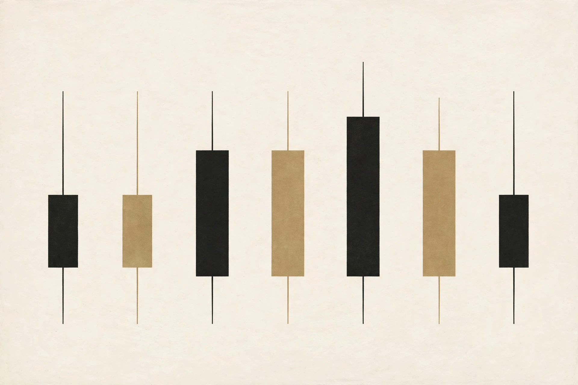
Four numbers, one shape
Every candlestick summarizes one period — a minute, a day, a week — in four numbers: the open (first price), the high (highest), the low (lowest), and the close (last). The thick body spans open to close. The thin wicks stretch to the high and low. That is the entire encoding, and once your eye learns it, a chart becomes readable at a glance.
Reading the body
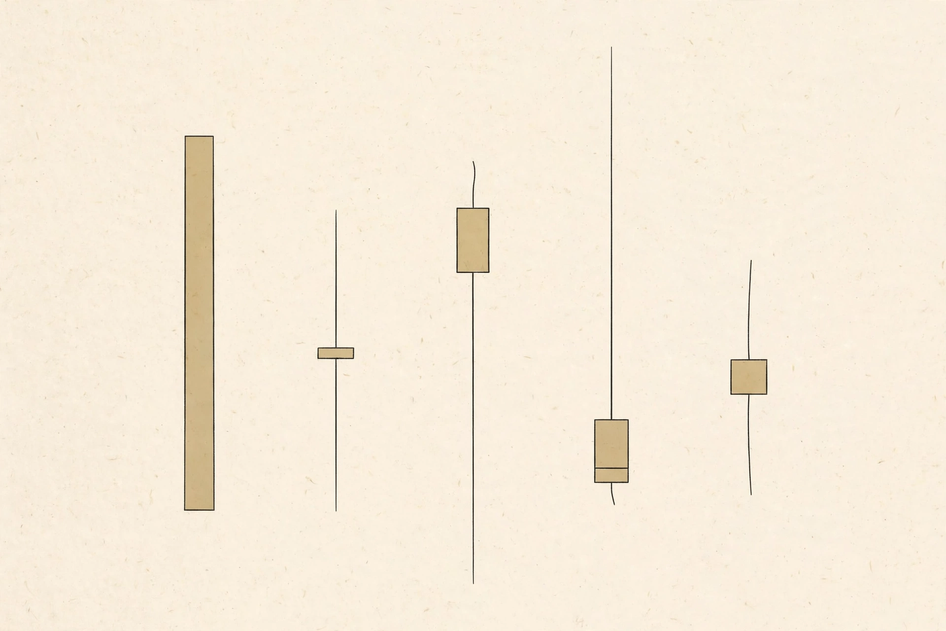
The body shows where the period started and ended. A long body means the close landed far from the open — conviction during that period, in one direction. A tiny body means open and close nearly matched — indecision, a tug-of-war with no winner. Body length is a measure of how decisively the period resolved.
Reading the wicks
The wicks show how far price probed beyond the open-to-close range. A long upper wick means price pushed high but could not hold it — eagerness faded into the rise. A long lower wick means price dipped but recovered — holders stepped back in. Wicks are footprints of failed moves; they show where pressure appeared and where it was absorbed.
Direction at a glance
By convention, when the close sits above the open, the candle reads upward (often drawn hollow or green); when below, downward (filled or red). Color is just direction made instant. Do not over-read it: an upward candle on a daily chart can sit inside a week that fell hard. Direction is always relative to the period the candle covers.
What a chart actually shows
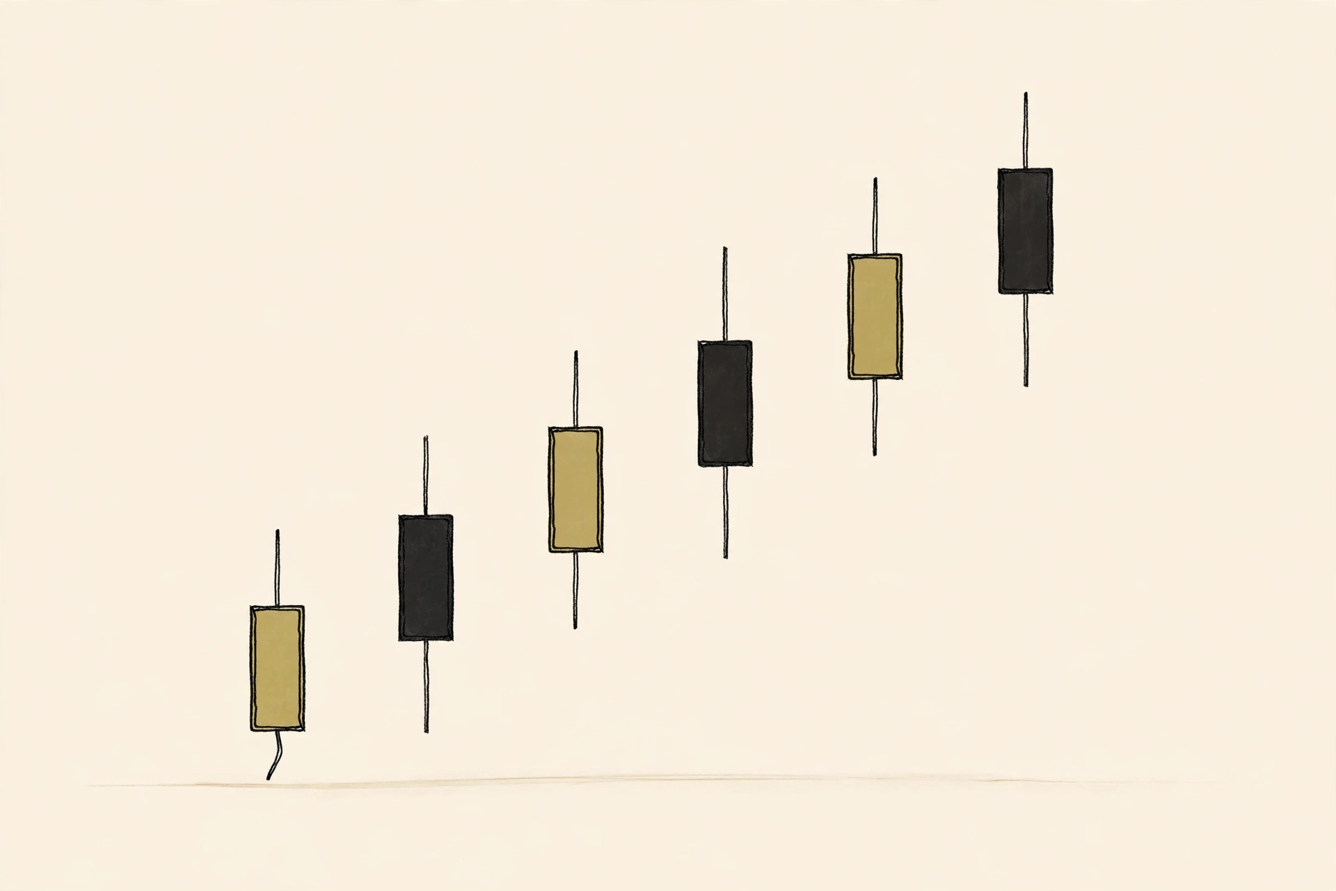
A chart is these candles in sequence — hundreds of periods, each compressed to one shape. Zoom out and each candle covers a week; zoom in and each covers a minute. The shape of the story changes with the timeframe, which is why two people can look at “the chart” and disagree: they are looking at different compressions of the same history.
One candle lies; context talks
A single dramatic candle means little on its own — one period's conviction often reverses the next. Candles earn meaning from context: where they appear (after a long decline? at a level that held before?), and what surrounds them. Read candles as sentences, never as headlines. The chart is the paragraph.
Worked example: Reading three candles
Illustrative descriptions, to practice the vocabulary.
| Candle | What you see | What it says |
|---|---|---|
| Long body upward | Open $50, close $56, short wicks | Decisive period; holders in control throughout |
| Tiny body, long wicks both sides | Open $56, close $56.20, high $59, low $53 | Tug-of-war; price probed both ways and settled nowhere |
| Small body, very long lower wick | Open $54, close $53, low $47 | Sharp dip fully recovered; dip-buyers absorbed the pressure |
Same chart, three different sentences. None of them predicts the next candle — they describe what just happened, precisely.